
A Library and Dining Room Design Inspired by a Haunted Painting...

Hello my friends! I'm in the middle of a couple-week stretch with a lot of DIAD sessions and I'm determined to share some of them here with you on the blog!! This is a fun one...
We tackled my repeat client's dining room and adjacent library space. My client had installed a gorgeous wall of builtin bookcases several years back on the dividing wall of the spaces. Now, she wanted help creating a roadmap for these to rooms to tie in with the rest of her gorgeous home.
Here are the spaces in question:


Both rooms have great architecture and charm, but the dilemma for both areas is that there is very little natural light. My client had originally painted her dining room this dark blue color, however the exposed lightbulbs and lack of soft lighting made the room feel dark and harshly lit.
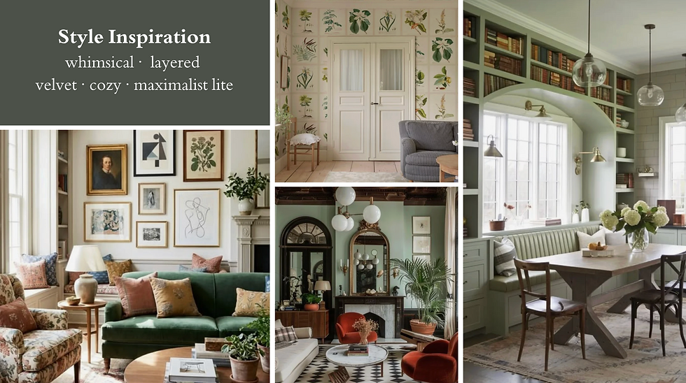
Our goal was to soften this room up and make it feel a little gentler. In the library area, my client was drawn to color drenched spaces, and anything with an english/french/european sort of a vibe. We decided on "Maximalist Lite" as her personal design style, because while the spaces she was drawn to were definitely in the maximalist vein, she felt there was often just too much stuff in there.
Here's some of her inspo images:

SOME JUICY GOSSIP: My clients have this gorgeous original oil painting in their library space, and they definitely wanted it to remain in a prominent place in the space.
BUT! They claimed she was...dun dun dun...HAUNTED!
Rumor has it someone died in my client's house (maybe not a rumor? I forget!), and ever since purchasing this painting, every once in a while they'll walk into the room and she'll be completely crooked for no apparent reason...spooooooky!!
Strannnnnge things happening, folks! But haunted or not, she's real pretty and I loooove the colors within the painting - so that's where we started!
The Library and Dining Room Layouts
Layout wise, the dining room was pretty straight forward—we planned to use her existing table, and fill out the rest of the items with new pieces. We did, however, notice that her dining chandelier was not centered on the connecting cased opening, and we felt it was worth it to move it over the small amount required to have that view feel very symmetrical.
The library, however, is such a long and narrow space, which is super common in colonial houses, and it can be tricky to figure out the flow!
My client had a good instinct in her original layout, which pulled the seating area into the center of the space and had the accent chairs floating in the center room. I definitely saw an opportunity for more pieces to fill out the room, and because we were leaning maximalist/eclectic, we could leaning more toward too full than too minimal.

We originally wanted to keep the sofa and the two accent chairs, but in the end I felt the sofa contrasted the style we were after too much, and it was also a liiiiittle too short for the long narrow space.
I opted for a 110" sofa, switched up the layout of her accent chairs and brought in a new, very large ottoman. I wanted a couple little stools in the space that could be moved around and also used for popping a squat to look at book titles. I planned for larger side tables, and also brought in the long credenza from her dining room, which is another piece that she really loves and which is meaningful to her. To address the lighting issue, I knew I wanted a lighting source on each side of the room, so we have the two table lamps flanking the sofa, one on the far side of the credenza, and a wall mounted lamp in the corner by the book case.
I also planned for a large mirror above the credenza to bounce around the light, and popped in a few additional accent tables, a blanket basket, and utilized her existing antique plant stand.
The Library & Dining Room Furniture Design Plans
I wanted to use the haunted painting as our main jumping off point for the library design, so planned for it to be nice and center right above the sofa. I had a few different concepts to show my client, including one with a rusty red velvet sofa, a couple different ottomans, and a version with the same sofa in taupe in case that was too bold for her (it wasn't 😉).
Red Sofa + Patterend Ottoman

Red Sofa + Checkered Ottoman

Taupe Sofa + Checkered Ottoman

In the dining room, my client had a few mural wallpaper options she was already considering, and I loooooved one of them, so we used that as our wall treatment. We swapped out her harsher sconce lighting for something with soft lines and a shade for soft lighting.
Similarly, I swapped out her angular chandelier with exposed lightbulbs for one a round one with a shade. This will help soften up the overall lighting in the space and make it feel cozier to spend time in there.


For the back wall, we kepd my clients existing gallery wall kit, which I thought was adorable, and loved how the organic shape of the wallpaper would be the backdrop for the rectangular shapes of the frames.
For her sideboard, we chose a nice black stained wood piece with turned legs, a brown glossy table lamp for more warm lighting, and a vintage style gold arch mirror to reflect the light from the sunroom doors opposite that wall.
If you'd like to see an example of my clients full design plan, click here to view that.
The Wrap Up
I was really pleased with the way this space came together!
And the best part? We were able to create this entire design, which my client can now execute on their own timing, all in a single 5-hour Designed in a Day session.
I find that setting aside this focused, limited amount of time helps my clients to get really clear on their desires and come to our session very prepared. It also lends to quicker decision making, along with coming up with some very creative solutions.
My clients left this session with a fully customized design plan.
This included the style boards for each room to showcase how the pieces will work together, along with PDFs of the layouts so they know how to set everything up when they arrive, as well as links to the individual items where they are able to source the items I've suggested.
(BTW, if you like any of the items in this design, they are all available for purchase! Message me in the contact form and I'll send you pricing.)
Is "Designed in a Day" Right for You?

Designed in a Day has hands down become my most popular service, and it's easy to see why!
It's cost and time effective, and it's super flexible as far as the kinds of projects we can tackle, the range of budgets it fits, and the kinds of styles and functionality needs that clients have.
If you'd like to find out more, you can click here to view the service, and then complete my project intake form here. I'll reach out to schedule a discovery call to discuss your project.
Can't wait to help you create a space that works for you!!


Choose the right direction, time your kick carefully, and try to beat the goalkeeper. You can also test your reflexes by stepping into the role of the keeper. football games
Searching for 192. 168. 12. 1 can lead to useful information about router administration and local network settings. Clear instructions are especially helpful for beginners who want to access the admin panel, update Wi-Fi settings, or troubleshoot login issues.
My search for useful information on this topic led me to this article, and I found it quite relevant. It helped me make better sense of the subject and gave me a few points to consider. I also decided to explore Shopify ERP integration services from digitalsuits further. Good information is especially valuable when it reaches you at the right time.
After reading several articles on this subject, this one finally gave me the answers I was looking for. Everything was explained in a logical way. I also looked through the crypto on ramp and off ramp guide, and it helped me understand a few extra details.
This is such a cool concept! I love how you tied in the haunted painting with design elements. Have you ever considered how different colors influence mood in spaces like this? cookie clicker I once painted my dining room a deep blue and it totally changed the vibe! What's your favorite color for creating an eerie yet inviting atmosphere?