The Evolution of Our Living Room & A Designer's Reflections on Home as a Work in Progress
- Lauren Figueroa, Founder + Principal
- Feb 19, 2020
- 11 min read
Updated: Apr 12, 2023
As an interior designer, I am naturally inclined to always be thinking about space, dreaming up new concepts, and itching to implement them as soon as possible. That's great when it comes to our client's homes, but with my own home, it can be sometimes feel exhausting.
While we're feeling more and more established as we enter into our thirties, as business grows, and as we settle into our home and community, it can sometimes feel like we're living in the "not yet" or "almost there". Does anyone else feel that??
In case you didn't notice, comparison is a killer of joy. I'm a young professional, and if I can toot my own horn, I'd say I have pretty great taste. But being able to recognize something as excellent doesn't always correspond to your skill level in a particular area.

It's pretty typical for our team to be working with substantial budgets when it comes to client projects. That said, I for one know that not everyone has a designer-furniture budget.
It can sometimes be discouraging when we don't have the funds to utilize the quality furnishings that we're putting int our clients spaces, or even the option to completely redo a whole space at one time. But in the last year, I've started to cultivate a GRACE for my space that acknowledges that our homes—much like ourselves—will always be a work in progress.
I grew up in competitive dance, and you learn to recognize excellent technique and artistry far before you come to master it yourself—if you ever do. This can be very discouraging at times! I think it's a reason why so many creatives give up on creating. And it's also why it is so very important to learn to give yourself GRACE in the process, and to not compare your work to someone else's, especially if they are farther down the path than you.

When I first started LFID, I had good interior design taste, but I'll be the first to say that I was not the greatest designer in the world! It's amazing to me to see how my style and skill in design has grown and changed, even in the five short years I've been on this journey.
The challenge is that it's so easy to compare your early steps of the journey to someone who has been in the biz for years—social media is horrible for this!!
For that reason, I've actually made a point to unfollow most designers on Instagram, save for two or three whose styles truly inspire me. It's too much pressure! Don't compare yourself—or your space, or your skills—to anyone but yourself, because that's how you measure growth.
Me after I'd scroll instagram + compare myself
to all the amazing designers in the whole world.
When I focus on my own journey of growth, it's actually pretty amazing to see how far I've come—and I bet the same goes for you too! Whether it's design related or not! AND, if you are someone who is committed to always learning, growing, and becoming the best version of yourself, in five years, you'll look back at yourself today and say, again, "look how far I've come!"
So today, I want to take a trip back to my first year full-time in business (back when I was The Georgia Pear Interiors, if you've been with us long enough to remember that!) just after we moved into our house, and talk about this evolution of our living room—and me as a designer—over the last five-ish years.
Are you ready?
Living Room Version 1.0
Here are a handful shots of our living room just after we moved into our house in 2015. We were moving from a small, one-story two-bedroom duplex—probably 1,200 square feet—into a 4 bedroom three story house with 2,400 square feet PLUS an 800 square foot finished attic space.
Needless to say, it felt super daunting! We didn't own nearly enough stuff at the time to fill the space, and as a designer, having unfinished spaces is like torture.
Below you'll see our make-shift table built from two craft store crates with our extra dining table leaf sat on top. We had a Homegoods crate serving as a side table, and many a thrift-store-garage-sale table, lamp, and accessories throughout the space.

The sofa and chair were a thrifty buy from Value City Furniture, back before I knew much about furniture. I bought the sofa, chair, and matching love seat (which is in our guest bedroom) all for $900!! I will say, aside from one support in the sofa that cracked a couple years ago, they've help up really well for being so budget friendly.
I actually discovered last year that I could take the cushion covers off and wash them, which has been awesome with having a dog that sometimes brings mud into the house.
They're also surprisingly comfortable, and while I do have plans for a nice quality sofa (maybe even sectional!) in the future, I appreciate that these weren't expensive because I don't stress out when Ruby tracks in mud or when one of us spills coffee on the cushions.

So moving on...at this time I had recently bought a sewing machine and was making tons of pillows (that I now am not a fan of, however I appreciate that I was using at least a little color at the time, which isn't the case now! haha...).
It's super interesting to me to see how my sense of scale and balance as grown and developed. The longer I've been doing this, the more I've learned that fewer, larger accessories usually makes for the best impact. The mantle below, while cute, feels cluttered to me now and heavy on the left side.
TIP—Use fewer, larger accessories or pieces of artwork in your space. This helps it feel less cluttered and more balanced.

You might recognize these cute barrel chairs (above) from our Airbnb, The Loft on Madison. They've definitely served us well over the last five years! $20 bucks for the pair at a garage sale...YES PLEASE.
Since we had just purchased a big old house, we didn't have a lot of extra spending cash for things like area rugs, which can be pricey even when you go the budget route, so our living room went rug-less for quite a while.
As for artwork, the piece below (which now hangs in our dining room), was painted for us as a wedding gift by my girlfriend Sammy, and was based off the poem Sonnet 17 by Pablo Neruda, and the mantle photograph (two below) was taken by our friend and photographer Chris Cox.
These two pieces, while they've moved around a lot, have definitely been staples in our space!


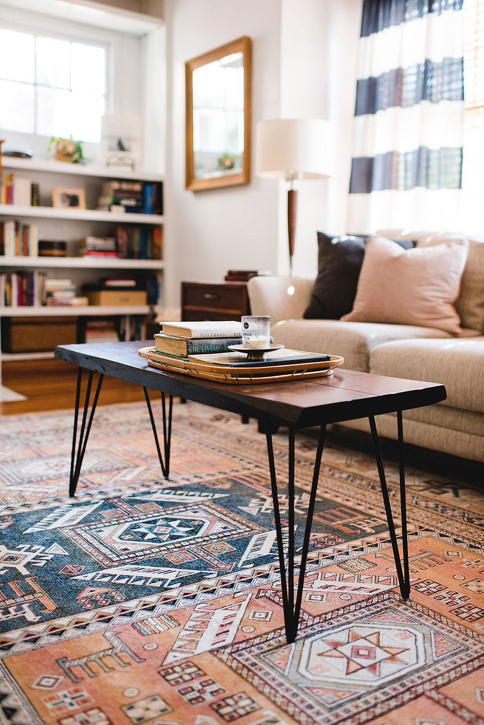
- Living Room Version 2.0 -
Next rendition! The black MCM style chair (below) didn't end up making the cut—I returned it, but it was fun to explore brining the black and wood element into the mix. We swapped our makeshift coffee table for this hairpin leg table/bench that had previously lived in our sunroom.
Underneath, I added this small accent rug to bring a little softness to the room—and also to protect our wood floors! I would never spec a rug this tiny for a client, however, sometimes you have to work with what you've got, and this was what we had!

The rolling bar cart was one I had purchased for a Home Show Designer Showcase space, so that served as a side table for a little while (now it's in our dining room).
The artwork moved around a bit as well. We were super into wine at the time (ummmm still are!) so we purchased a wine map of France and had it framed (which, now, feels too big paired with those tiny little accessories; if I had layered the large map with another, medium sized framed print, that would have worked nicely).
The framed photograph of the man in the tent moved over beside the piano (you can sort of see that above).


- Living Room Version 3.0 -
A few things changed in version 3.0 (not least of which was finally having a real live professional photographer!!! Shout out to Alyssa Wagner!).
Enter the rug! The rug is, of course, a major game changer. It makes the room feel larger, yet grounds and establishes the seating area as a "zone".

We moved the blue barrel chairs up to our attic (the pattern/colors were clashing too much with the rug), and turned the large arm chair on an angle. This opened up the room and it felt way less crowded. It also made the fireplace more visible, which is nice, since it's definitely a focal point.
We also added in a small white drum side table. This was great because, while we had a coffee table, it's really not a comfortable distance for setting a drink down when you're hanging out in the space.
TIP—make sure there is a surface within a comfortable arms distance for every seat in your living room (and coasters if you are picky like me!). This makes a space super functional for hosting and hanging out!


You'll notice the new vintage side table on the far side of the sofa (found at Changing Thymes) and updated MCM style lamp (thrifted). These were actually in the last version of the room, but you couldn't see them in the photos.

At this point, I finally start to get the scale of things right in the space. The mantel decor feels balanced (siiiiigh finallllly) and the rug is appropriately sized for the furniture.
Since the rug is quite busy and colorful (for me), it was fighting with the colors in the framed map. Instead, I used a beautiful framed cockatoo print, which was previously hanging in our bedroom, which played really nicely with the colors in the rug. This I layered behind the framed photograph by our friend Chris.
TIP—Layering artwork is a GREAT way to style a mantle and gives some dimension to your decor. I also pared way back on the accessories to make it less visually cluttered and centered.


Below, you can see that I swapped out the painting from our wedding for a mirror to the left of the sofa. I love catching glimpses of the room in the mirror—it gives a perspective of your space you don't always see and makes everything feel more connected.
TIP: a mirror is a great option when you need something on the wall, but where a painting or photograph might feel too busy.
To the right of the sofa (below), you'll notice a new piece of artwork. It's just a simple framed print from target. I liked that it tied in with the blue in our curtains, as well as our dining room walls, which are also a deep blue.

Another new element in version 3.0 is the grid of frames over our credenza (below). I hadn't photographed that wall previously because there was nothing there (other than our TV, which I typically hate having in a living room anyway. It now lives in our Airbnb—lucky guests!).
Three Septembers back, after I had returned from a work trip to Italy and taken HUNDREDS of photos (because everything in Italy is photo worthy), I had images printed and put them in these awesome thin gold metal frames from Target. The photos were so fun because most of the architecture in them matched the rug perfectly—a happy surprise!


Lastly for this version, I'll just mention the gold mirror over the piano (below). This was present in version 2.0 of our space, but I didn't have a good photo of it. The mirror is great both functionally and aesthetically!
We don't get a ton of light in our living room since our house faces East, so it reflects some extra light into the space. It's also great for Larry, who is often practicing conducting or singing in this room, and it's helpful to have a mirror to practice with.


- Living Room Version 4.0 -
And finally, we have the living room as it looks today (that is, as of the end 2019, as I think this post goes up in February!). This, to me, feels like the most drastic change.
We moved the large arm chair out of the space (it's now in our bedroom), and replaced them with these two blue vinyl Danish Modern chairs (I found these on facebook marketplace—big win! I LOVE THEM.).
The chairs changed the whole dynamic of the space. It felt lighter, more sophisticated, less clunky, and less matchy-matchy. It also opened up sight lines because the chairs have a lot of negative space (meaning you can see through them).
The next new piece was our coffee table. This piece was a wild card! I found it on facebook market place for something like $20 bucks, and I had no idea if it was going to work. But I figured, for $20 bucks, it's worth the risk, and it changed the whole feeling of the room!
The round white top brought in the contrast we needed from the rug, which was a nice change from the wooden table (we already had a lot of wood tones going on in the space), and the white marble brightened up the whole room.
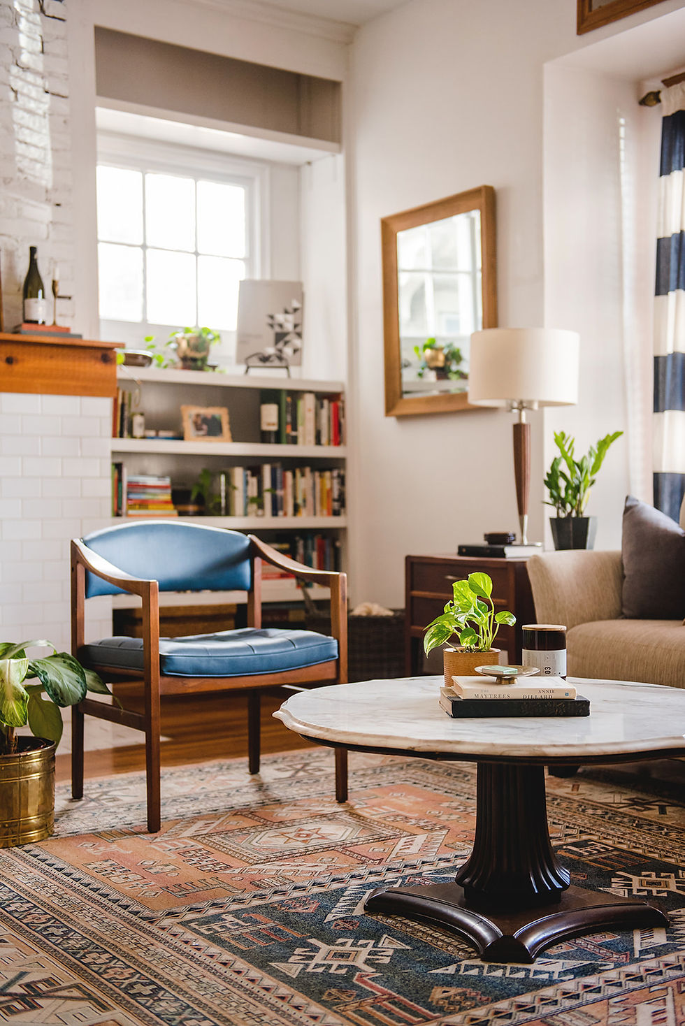
That I fell in love with the style of the table was the real surprise. While I love traditional architecture, I don't typically lean toward ornate style furnishings (though I'd say that's changing).
BUT, here I am, in love with the scalloped edges and funky pedestal base. It's fun to be surprised by the styles you adopt!
A few new pots and plants made their way into the space as well: a fun palm in a white ceramic pot, a small philodendron in a thrift-store-found clay pot, a palm tree in a terra cotta pot, and our old fern got a new (old) pot in the form of an antique brass tin.


Above, you'll notice the beautiful cabinet to the right of the sofa—another awesome facebook marketplace find! This on has a super sweet story to go with it:
It belonged to the mother of the woman who sold it to me, who had passed away. Turns out, she was also a pianist had used it to store music for her piano studio—exactly what Larry would be using it for! That and her mother had been on the board at St. Cecelia Music Center for years, and so is Larry!
Needless to say, she was super delighted that it was going to someone with similar passions to her mom. So this piece felt extra special in addition to being completely beautiful and perfect in every way.


Lastly, we swapped out the green vintage chair in the corner for a palm tree (left to us by our previous housemates) and my guitar (above right).
The chair now lives in our Airbnb and looks awesome there! Plus it didn't make sense to have a chair floating over there all alone; when anyone would sit in it, it'd feel like they were way out of the group, and I also dislike having a chair behind a chair, if that makes sense...it feels odd to have someone sitting behind you in a living space like this...it's sort of like bus seats or something...
Anyhow, the combination of all the style elements in our living room is a great example of how to layer a space with multiple style influences and still have it work: we have danish modern chairs, a boho rug, MCM end table, traditional coffee table, transitional sofa, and all inside a 1915 colonial house!

- The Wrap Up -
In sum, I'm more comfortable now with the process of adding to and changing our space little by little over time. It's quite different than creating spaces for our clients, which is maybe why it was hard for me at first.
With client projects, of course, there's more at stake to getting it right the first time—however, the with larger budgets, it's easy to find pieces that work in the space because you don't spend so much time hunting for a piece that fits a budget-friendly price point.

That said, I hope you will be encouraged that even a designer can struggle to bring their own home together, but if you are patient and can get comfortable living as a home "in progress", it can actually be very fun and creatively rewarding to grow your style and space over time. I'm constantly stealing items from one room to tryout in another. A rug here, a lamp there, a chair here, artwork there.
TIP—Moving pieces around your house is a great way to make the space feel fresh and breath new life into a piece you were tired of in it's old space.
So now it's your turn! I want to hear about YOUR design journey. Have you made peace with home as a work in progress? Or are you a set-it-and-forget-it kind of a home maker? Are you someone who would hire our the design side of things, or do you love the creative challenge of bringing together a space? Tell us below!

Work with Lauren Figueroa Interior Design

LFID is a full-service interior design firm serving West and Southeast Michigan known especially for our Designed in a Day service.
We work with clients from Detroit to Novi to Clarkston, and Grand Rapids to Holland to Traverse City—and anywhere in between! We pride ourselves on creating bespoke, people-centered spaces—because after all, people are what this life is all about!


Comments