The Colors in Your Space Impact Our Moods—Here's How to Use That To Your Advantage!
- Lauren Figueroa Interior Design
- Aug 7, 2019
- 3 min read
Updated: Apr 11, 2023
As a person who lives daily in the world of design, I'm probably overly in tune with the way spaces influence my mood and behavior, and color has a big part to play in that! When we bought our house four years ago, almost every room in the house was painted white.
I adore white—it’s clean, bright but calming, and allows you to play with fun pops of color in your furniture and accent pieces. There are a few rooms, though, that don’t get a lot of natural light, which can make your white walls look yellow and dingy.

As we decided which rooms to paint and in what color, I grew increasingly interested in this topic of color psychology.
Since high school, I’ve been a lover of psychology, and am always looking into new personality typologies (I’m currently wayyyy into the enneagram—definitely check it out! I'm a 3, if you were wondering...), and this color piece is very helpful in understanding why we feel differently in the various spaces where we spend our days.
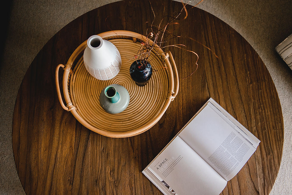
There are two broad categories of color: warm colors and cool colors. Warm colors include your reds, oranges, and yellows, while cool colors are blues, greens, and purples. I would say that the greyscale would tend toward the cool side as well, though there are definitely warm grays and whites.
A few shots of my warm neutrals + cooler colors themed home


Warm colors, in general, are said to increase your appetite, evoke warm comfortable feelings, and increase your energy level. Cool colors, on the other hand, promote calmness, meditation, and focus.
A well-designed space will have a balanced blend of warm and cool colors, but knowing their impact can be helpful as you think about the functions of the various rooms in your home and what will be the most significant color in each space.


Personally, I tend toward warmer neutral tones mixed with cooler colors as my main theme throughout a space, though I see this evolving all the time.
Color-wise, I'm drawn to blues, greens, and then anything in the neutral family...white, off-white, black, charcoal, geige, ivory, taupe...extremely warm or overly saturated colors are too energetic and distracting for me. Part of this may have to do with the fact that I work from home, so I need spaces that allow me to focus, be creative, and use my energy wisely.

According to the enneagram personality typology, my personality type is a number 3—The Achiever. We are incredibly task driven and don't often slow down. I wonder if I'm drawn to these subdued color schemes because, internally, my brain is always going a mile-a-minute, so I just don't have the capacity to take in a super stimulating environment.
So what about you? What color schemes are you drawn to? How do you think this ties in with your personality?
The next time you need to choose a color for a space, do a little personal research: As you go throughout your day, take note of your experience in your various environments, and ask how the colors play a role in that. If you are an excited, animated personality, perhaps you’ll prefer the energy of warm colors. If you need a space to focus for long periods of time, a subtle cool color may be the right choice.
Do you need help selecting colors or fabrics for your home? Looking for a new style and ready to get some help on the design? We might just be the firm for you.
Work with Lauren Figueroa Interior Design

LFID is a full-service interior design firm serving West and Southeast Michigan known especially for our Designed in a Day service.
We work with clients from Detroit, to Grand Rapids, to Holland, to Traverse City, and anywhere in between, and we pride ourselves on creating bespoke, people-centered spaces—because after all, people are what this life is all about!
If you have a project on the horizon, get started by telling us a little about your vision here, and you can view past projects here. Thanks for stopping by!


The endless gameplay mode of Drift Boss ensures that every run feels different. Since there are no levels to complete, players are constantly motivated to improve their scores and push their limits.