Taking An Early 2000's Living Room From Bland & Basic To BAM!
- Lauren Figueroa
- Feb 17, 2021
- 5 min read
Updated: Apr 13, 2023
Our second reveal from our Ada House on the Hill project is here!
Today we're taking a look at the before/during/after of the living room space, but if you missed it last week, you can see the kitchen reveal here.
The living room was such a fun before and after because, while we did change a lot of details, this room really wasn't a complete gut. We used many of the elements that were present when our clients moved in, and I think it's such a great example of how just a few simple changes can make for a BIG impact!

The living room is large and somewhat oblong, and when we first saw it, it was very, very beige. Beige walls, beige carpet...SO MUCH BEIGE. We kept the builtins in tacked as is, but planned to give them a paint job and swap out the hardware for something more up to date.
// BEFORE //

We did, however, know from the get-go that we wanted to update the fireplace. While it's was big, the surround felt dinky compared to the rest of the space, and the icky brown and gray slate had to go.
Initially, we'd planned to do a more transitional style wood surround with a marble tile or slab, but as the design evolved, that just wasn't meshing with the overall feel we were trying to achieve.
The fireplace was the last element to fall into place, and as we scrolled through Pinterest, a fireplace style that I'd first seen used by Studio McGee caught my eye. It felt stately, but current, and was the perfect blend of traditional and modern.

Inspiration Image Via Studio McGee
We put our own twist on the design using a custom wood surround in a warm white and using a contrasting concrete hearth installed by our friends at Hard Topix.
Our design would also be more rectangular and horizontal, rather than squared off, giving it a slightly more midcentury look. We also liked that the concrete added a new material and gave some tonal interest to a mostly white space.
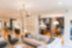
// AFTER //
We wen't back and forth on whether we should but the TV above the mantel or create some kind of custom cabinet that would hide the TV on the right. In the end, we decided to go with The Frame TV by Samsung above the fireplace—saves the design every time!!
// BEFORE //

You can see in the listing photos that we also had some peculiar wall color transitions going on...
...beige on the fireplace wall, green on the window wall, back to beige on the wall that leads to the kitchen. Unless done carefully, all this achieves is making all the transitions and angles in your house very obvious, and it makes the space feel blocky, without a great flow.
Instead, we used the same light wall color (pearly white) throughout the entry/living/kitchen, and chose to do a fun contrast in only the dining area, which lent itself to feeling very distinct. This consistent and light color allowed for a perfect flow between these very open rooms.
As for the carpeting, we pulled out this fuzzy and very brown carpet, and replaced it with a beautiful, low-pile carpet with a linear design. Notice how the new carpet has a beautiful blend of grays, browns, and everything in between, giving it depth and making for the perfect base for this space.
// AFTER //

I also have to point out that we added a big, focal light fixture in the living room.
More and more, I'm loving this kind of a detail in a living room, especially if there's a natural place for it to be located: centered up with on both the windows and fireplace. This focal piece gives your eye a place to land on what was previously a massive white box of a ceiling, and it also helps define the seating area.
As for furniture, we wanted this to be a big, comfortable gathering place for the family. We utilized a MASSIVE midcentury inspired sectional with a bumper chaise—this means the chaise has a back, rather than just an arm, which makes it more comfortable for sitting upright on the chaise.
Also notice the wood detail that runs along the base of the sofa. This gives just the slightest contrast between the light sofa and the light carpeting, allowing it to stand out just a bit.
// AFTER //


The matching accent chairs were such a fun detail to this space as well. Both the kitchen and the dining area have a LOT of blue going on, so I wanted to tie that element into the living room as well. We did these in a beautiful bluish greenish super-cozy-fuzzy fabric, and went with brushed gold for the frames to tie into the kitchen fixtures, as well as the new cabinet hardware.

The coffee table is a vintage MCM piece, which the clients brought from their previous home. They knew they wanted to use this piece in the design, so we essentially built the room around this table.
The swivel leather chair was also from their last home, and while it wasn't a must-use for the space, it worked out to be the perfect final piece to round out the seating area. Just picture sitting there by the fireplace sipping on coffee in the mornings...bliss!
// AFTER //

On the builtins, you'll notice we played around with the location of the shelves, and we also added some magnificent library lights to the tops of each section. These add a little drama and bring in some more of that gold element we repeated throughout the space.
We also went for a more "styled" look, rather than simply function, since there is plenty of other storage for books and such elsewhere in the house.

A few fun styling elements to point out: we mixed in some new accessories with a lot of meaningful pieces and frames that the clients already owned. I particularly loved using their beautiful record collection and record player, as well as their beautiful set of Russian nesting dolls.
DESIGN TIP: when working with collections, especially ones that include lots of smaller items, is to group them together in a tray, box, or case. This allows them to visually act as a single item, rather than a bunch of little pieces, and helps avoid a space feeling cluttered.
Okay...now for some fun before and after shots.
Scroll away!
// BEFORE //

// AFTER //

// BEFORE //

// AFTER //

// BEFORE //

// AFTER //


We'll be revealing the dining room in this Ada House on the Hill project in the coming weeks, so stay tuned!
Work with Lauren Figueroa Interior Design
LFID is a full-service interior design firm serving West and Southeast Michigan known especially for our Designed in a Day service.
We work with clients from Detroit to Novi to Clarkston, and Grand Rapids to Holland to Traverse City—and anywhere in between! We pride ourselves on creating bespoke, people-centered spaces—because after all, people are what this life is all about!
If you have a project on the horizon, get started by telling us about your vision here, and you can view past projects here. Thanks for stopping by!
