Project Reveal: The Moody Ridgemont House Sitting Room
- Lauren Figueroa

- Feb 25
- 4 min read
We're back with our journey through the reveal of the Ridgemont House project!
If you missed it, the last couple weeks I've released reveals for the main floor great room, which included the main living area, kitchen, breakfast nook, and dining areas, the main floor home office, and you can see an overview of the full project scope here.
The Sitting Room Space Before
This room originally designed to be a formal dining room.
As you can see by the main floor layout below, we were not in want of dining areas! Between the kitchen peninsula, the breakfast nook, and dining area, we already have loads of places to land.
WHICH—is why we decided to turn the formerly formal dining room into a cozy sitting room for lounging, reading, or chatting with friends and family.


Above you can see the space as it currently stands. There's an interesting wood inlay in the flooring, which we all thought was beautiful, but a little strange for the updated style of the house, so we all agreed to cover it with a beautiful area rug.
We planed to keep the sconces, but we be swapped the chandelier for a flush mount light to help it feel less like a dining room.
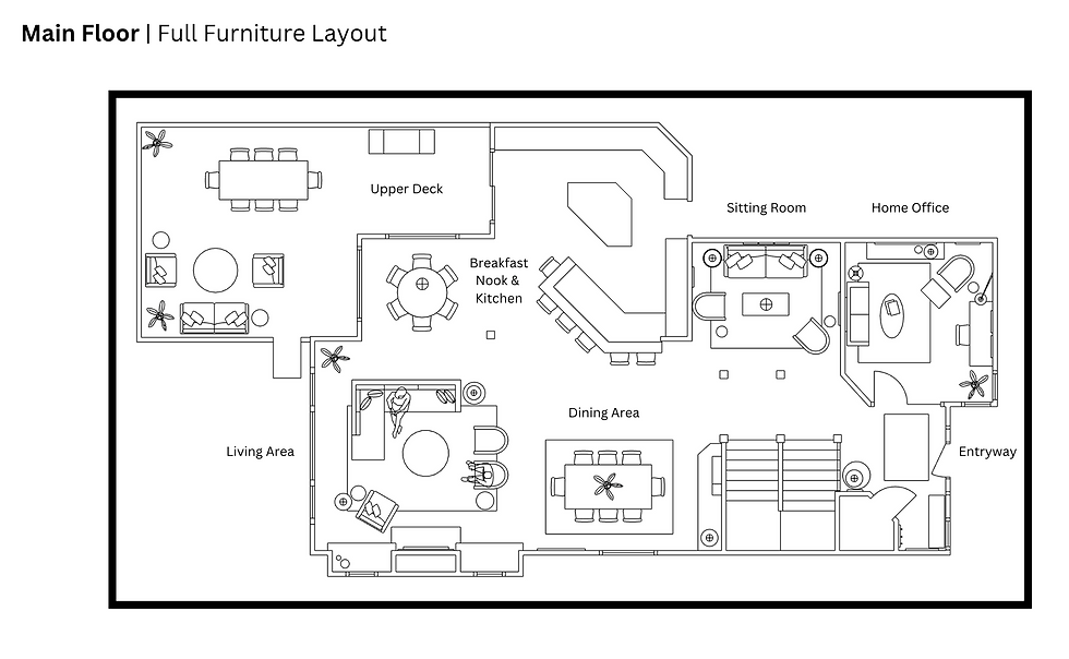
Take a look at the floor plan above to see how this space interacts with the rest of the main floor flow. The sitting room is just off the main entry and is tucked back into it's own little cove just beside the stairwell that takes up to either the upper or lower levels.
Sitting Room Style Inspiration
The below two spaces (found via Pinterest—if you know the original sources, please let me know!) were the two main style inspiration images for this space. My client wanted this area to be a bit moodier than the rest of the very bright house, and to feel a bit eclectic and warm.
Based on these, I knew I wanted to do some saturated color, maybe some velvet, and definitely some botanical art as well. If possible, I also wanted to bring in both green and orange.


The Sitting Room Furniture Layout
Below, you can see a closer view of the sitting room layout. I kept this area pretty simple: we weren't in need of more storage, and truly, we had a LOT of house to furnish, and I wanted to do some bigger budget elements in other areas.
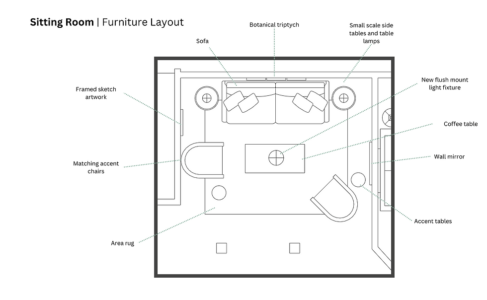
So, we planned for our main sofa to sit along the back wall with two small side tables and lamps on either side. Above the sofa will be a set of botanical prints.
We have two matching armchairs and drinks tables that can be moved about as needed based on how the space is used at any given time, and all will center around a rectangle coffee table.
On the longer of the two side walls, we hung a round mirror to help reflect light from the bright open great room, and lastly, everything is be centered on a large area rug.
Moody Sitting Room Design Plan
Furniture wise, I chose an olive velvet sofa as our main piece of seating, and complimented that with two exposed frame accent chairs in a dark burnt orange tone.
We found a place for our orange tones with both the area rug and the burl wood side tables, and we added some warmth and texture with the woven coffee table in the center.

The green in the botanical prints tied in with the sofa fabric, and we brought some eclectic flair with the iron pedestal drinks tables. I went with a nickel toned flush mount light to tie in with the existing sconces.
Lastly, I selected a framed vintage style sketch do add to the collected feel, and brought in an age brass mirror for the side wall to mix up our metal finishes.
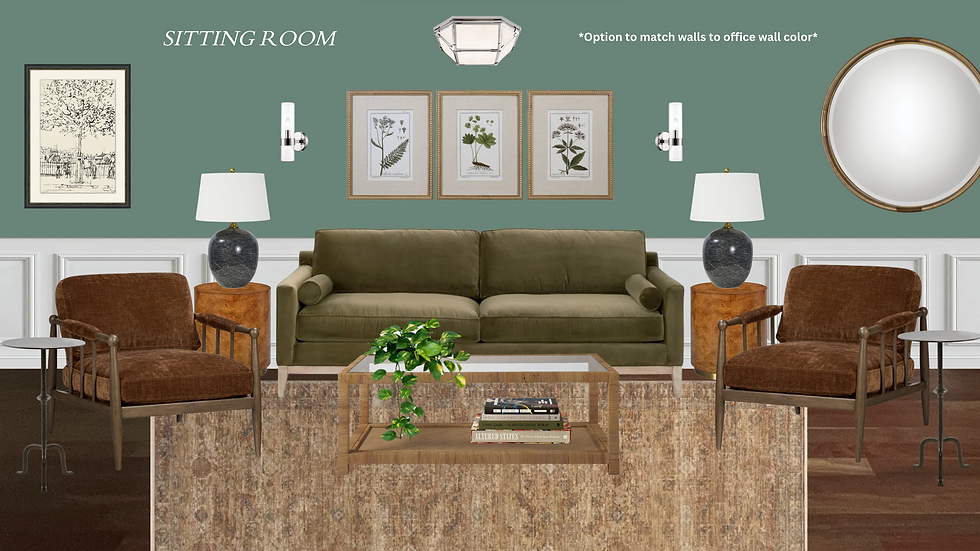
I initially designed the space with the plan that our wall color would remain the same, and then gave them a fun option where everything would remain the same, except the wall color would be changed to match the main floor home office space, which is just on the other side of the wall.
You can see how the wall color completely changes the vibe of the space! Which is your favorite?
Below you can see which direction we went...
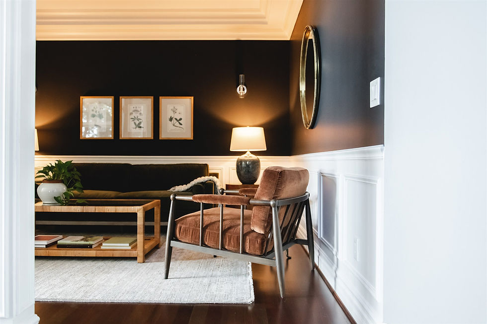
The Moody Sitting Room Space REVEALED 🥰
Okay, big kudos to Alyssa Wagner for capturing this space because it was NOT easy to photograph with these pillars in the way!!


It might not be intuitive to mix dark green and dark blue—at least it didn't used to be for me!—but I've been doing it a ton lately and loving the outcome. There's also whole lot of velvet in this space and I am NOT mad about it!!


I love the warmth that the burl wood side tables and the woven coffee table bring into such a dark space. Whenever you go dark and moody, you have to balance out the coolness with some warm elements like wood or natural textures so it doesn't feel cold:

The below shot gives you a really good sense of how the entry, office, and sitting room flow together and pour out into the great room. Its nice that even in such an open concept floor plan, we have a few cozy little areas tucked away:

I love how this space turned out and the reimagining of a formal dining space into a cozy sitting room. It's nice to have the option to have a space that has no TV and is solely for conversation or reading—more analog spaces please!!
Next Up...
Next week we'll revealing a small but important space in the Ridgemont house: the main entryway of the home.
Stay tuned!
Work with Lauren Figueroa Interior Design

For the last ten years, Lauren has been working with folks in West + Southeast Michigan—and beyond!—and is known especially for her comprehensive Full Service Interior Decorating service.
"I pride myself on creating bespoke, people-centered spaces—because after all, that's what this life is all about!"
- Lauren Figueroa


In snow rider you don’t just slide down a mountain, you chase adrenaline, master precision, and feel the thrill of winter racing wrapped in stunning visuals and addictive gameplay.